


Freybe Digital Experience Redesign
Role: UX / UI & Digital Design | Project: Rebrand | Agency: Pound & Grain
The Problem
As Freybe’s brand evolved, the digital experience no longer reflected its premium positioning. Across both mobile and desktop, navigation lacked cohesion, content hierarchy was inconsistent, and product discovery required unnecessary effort.
Users could access information, but not efficiently. The structure did not guide exploration, and the experience felt fragmented across breakpoints.


The Idea
•
The Idea
•
The Idea • The Idea •
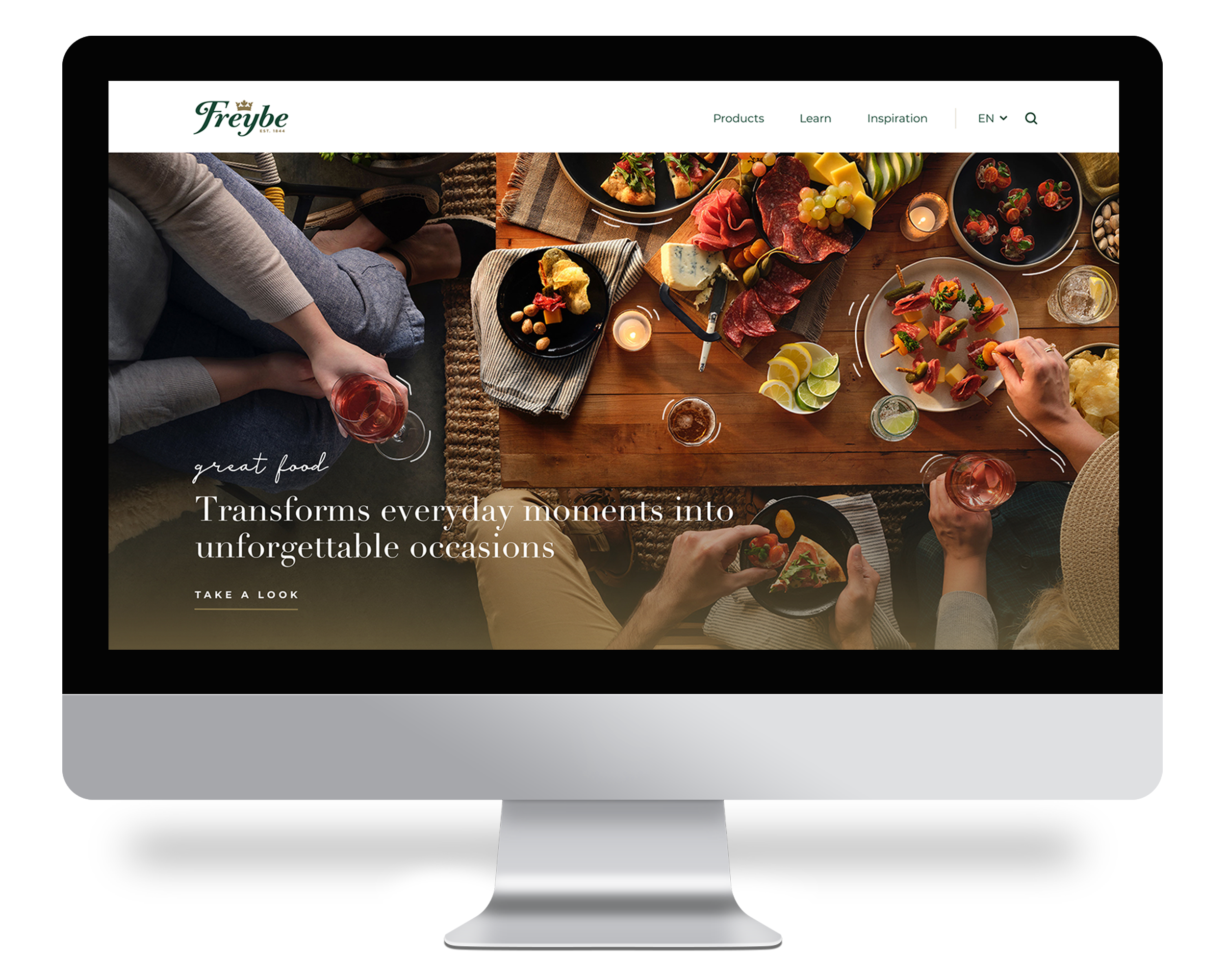
The redesign focused on aligning Freybe’s digital experience with its premium brand. A refined layout system and intentional use of imagery balance warmth with structure, supporting both storytelling and efficient product discovery.
Mobile-Forward Experience
Secondary research showed that 75% of Freybe’s audience browses and shops on mobile. The redesign adopted a mobile-first structure with simplified navigation, clearer hierarchy, and quicker access to product information.
Rather than scaling layouts across devices, each breakpoint was intentionally adapted to preserve flow and consistency. The result is a cohesive cross-device experience that feels intuitive on mobile while remaining structured and refined on desktop.
This approach established a stronger foundation for product discovery and long-term content growth.

Modular Foundation
To support scalability, the redesign introduced a modular layout system built around flexible content blocks. Consistent hierarchy, spacing, and alignment rules ensure cohesion across page types.
These structured components can be reconfigured for product pages, editorial content, and brand storytelling without disrupting the overall experience. The system enables the site to evolve while maintaining clarity and visual integrity.


Next Project
〰️
Next Project 〰️
